Site settings
Change the appearance of the site to suit your preferences
Illustration style
Vy’s illustration style reflects our values and goals through lines and tones that are reliable, charming, and surprising. It creates a shared visual language that helps employees, customers, users, and partners interact with our brand and services.
What is an illustration style?
An illustration style is a general concept for illustrated images used by Vy across departments, both internally and externally. These illustrations reinforce our brand identity and ensure clarity in all channels. Every illustration produced or used must follow this guide to maintain a consistent expression. The illustration style does not exclude the use of other materials for campaigns or unique needs. However, it is essential that such exceptions do not dilute or obscure Vy’s brand identity.
Direction and style
Vy’s illustration style is divided into four main categories to make it easier to apply illustrations in different contexts. These categories vary by level of detail, colour usage, and concept.
The line work should convey warmth and movement through soft shapes, rounded edges, and open endings. Vy is always in motion—moving forward. To emphasize this, depth should be created using overlapping elements or lines that guide the eye onward.
All illustrations must include padding of 6px on all sides.
A - Loading illustrations
Simple, abstract lines combined with coloured circles represent the journey from door to door. These are primarily used as animated icons to indicate loading states, and help users understand that their action is being processed. They also create the impression of faster load times.

B - Large icons
Large icons add life and detail where standard icons fall short. Since icons are generally static and abstract, we need a set of illustrations that can better convey messages. Large icons complement internal and external communication without taking up too much space.

C - Icon illustrations
These are more detailed, coloured illustrations that add depth and can stand alone or work alongside other visuals. They can also be combined to create larger, cohesive scenes.

D - Stickers
Stickers are primarily decorative elements for social media. They have a playful expression and work well on top of images or videos. Stickers come in two variants—with and without a ‘peel-off’ effect—and perform best against non-white backgrounds unless placed on an image. All stickers have a white border of approximately 4–6px.
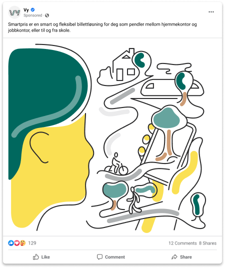
E - Illustrations
These are the most complex visuals in Vy’s illustration style, used when the illustration itself is the main element and message. Examples include holiday cards, marketing campaigns, or major app and web updates. They can also serve as decorative elements in digital channels. These illustrations often build on ‘large icons‘ or ‘icon illustrations’, combined with larger elements to create a layered story. They act as building blocks and must follow the overall style and direction guidelines.

Illustrasjon basert på Store Ikoner

Illustrasjon basert basert på ikonillustrasjoner
Colors
All colours in the palette are defined with specific values for digital use. To ensure accurate reproduction, only the specified colours may be used for illustrations. Colours exclusive to the illustration palette must not be used elsewhere.
The palette combines warm and cool tones with varying clarity, creating contrast with Vy’s profile colours and making the brand feel warmer, more vibrant, and personal.
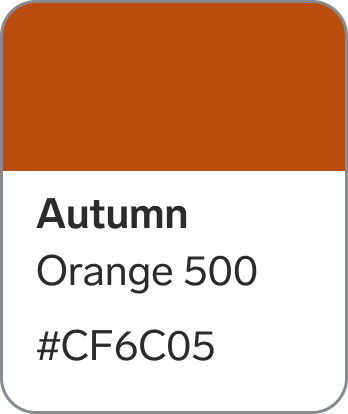
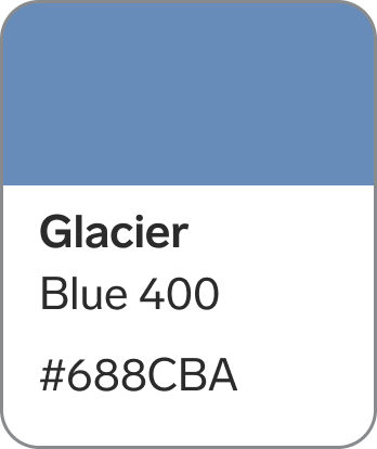
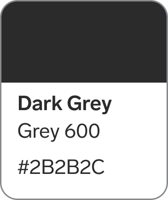
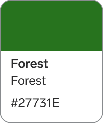
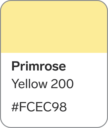
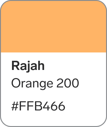
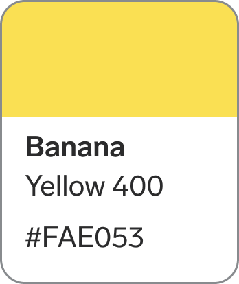
The illustration palette includes 14 colours from the main palette:
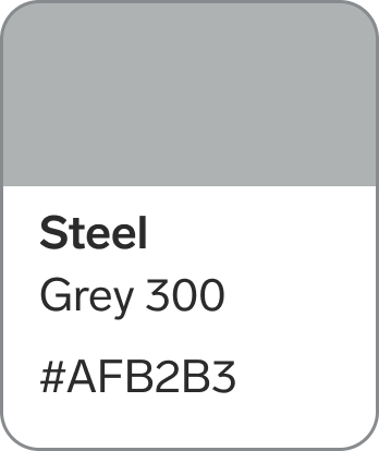
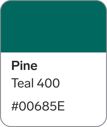
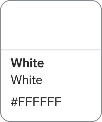
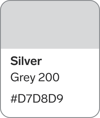
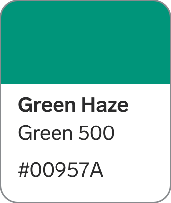
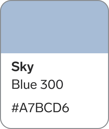
Dark Grey, White, Steel, Silver, Autumn, Rajah, Banana, Primrose, Green Haze, Coral Green, Pine, River, Glacier and Sky.
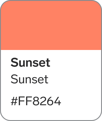
It also introduces 10 new colours for illustrations only:
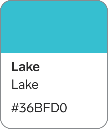
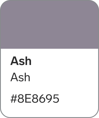
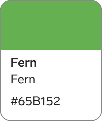
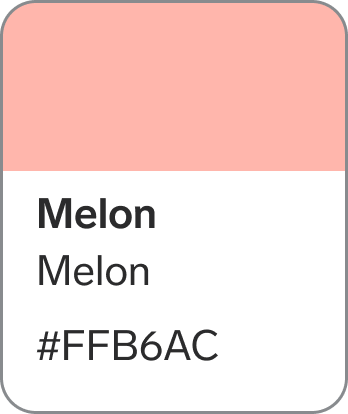
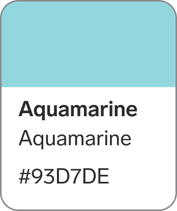
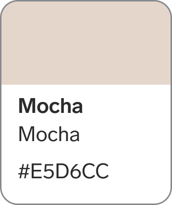
Almond, Mocha, Sunset, Melon, Forrest, Fern, Lake, Aquamarine, Ash and Chantelle.

Using illustrations
How should illustrations be applied in our internal and external channels?
It’s important to consider context and timing, whether for small or large applications. For example, illustrations should never disrupt a purchase flow or make information harder to find. We must respect our customers by ensuring a simple, intuitive user experience.
Illustrations should therefore act as secondary elements in digital channels.
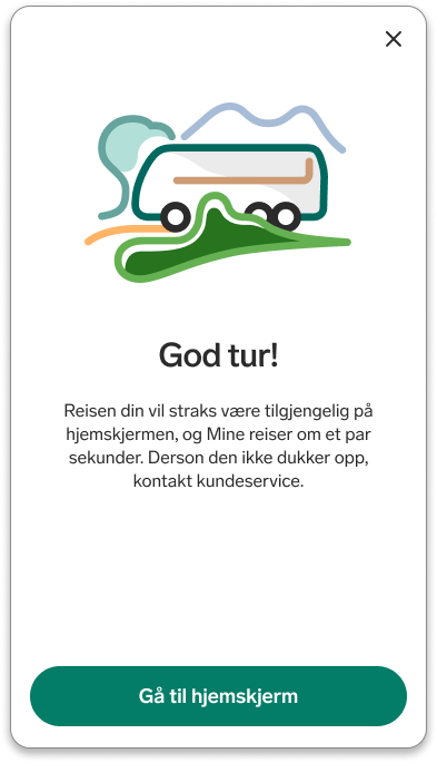
Examples of good use include a ‘Have a great trip’ message after completing a purchase, or visuals accompanying error messages or empty search results. Always pair illustrations with text for clarity and accessibility.
In social channels—both internal and external—illustrations can be used for campaigns, newsletters, presentations, and updates.
Quality assurance
All new illustrations, modifications, and usage cases intended for publication must be reviewed by Nina Tøgard, Vy’s brand manager. This ensures a consistent and universal expression across all channels.
Contact info
Email: nina.togard@vy.no
Mobile: +47 91653264